How often does something make you laugh AND make you want to get off the couch and do something?
Tag: politics
Categories
What Our Country REALLY Looks Like
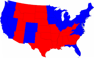
By now you might have seen those maps that are done to show how people voted. You know, the red and blue ones where blue represents Obama and the Democrats, and red represents McCain and the Republicans. Never mind that in most other countries red usually represents what is called the left and blue usually represents the right, but these maps are confusing for other reasons too.
Mostly the political maps are confusing because they are drawn for geographical purposes and not based on population (how many people there are). Geography works for when you have to get from place to place (like walk or ride your bike) but it doesn’t represent people (and how they live or work or vote).
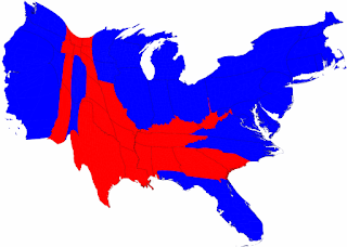
This is what it looks like when you change the map and draw the states in terms of how many people live where (i.e. make the more popular regions larger). It shows you how much Americans wanted Obama — a whole lot! (Unless maybe if you live in Texas).
And just to remind you, this is what the map looks like when you forget about what matters most in this world: people.
If you want to learn more about these maps, you can click here.